
Web
2017-2018
CLIENT
Chipp'd
INDUSTRY
Stationary, Gifts
ROLE
Brand redesign, UX UI
StoryChips offers a new way of sending gifts cards and stickers with some tech, by creating web based page connecting it with a QR Code.
My role here was to redesign the brand and product around it making it more simple to use.
Brand
Brand
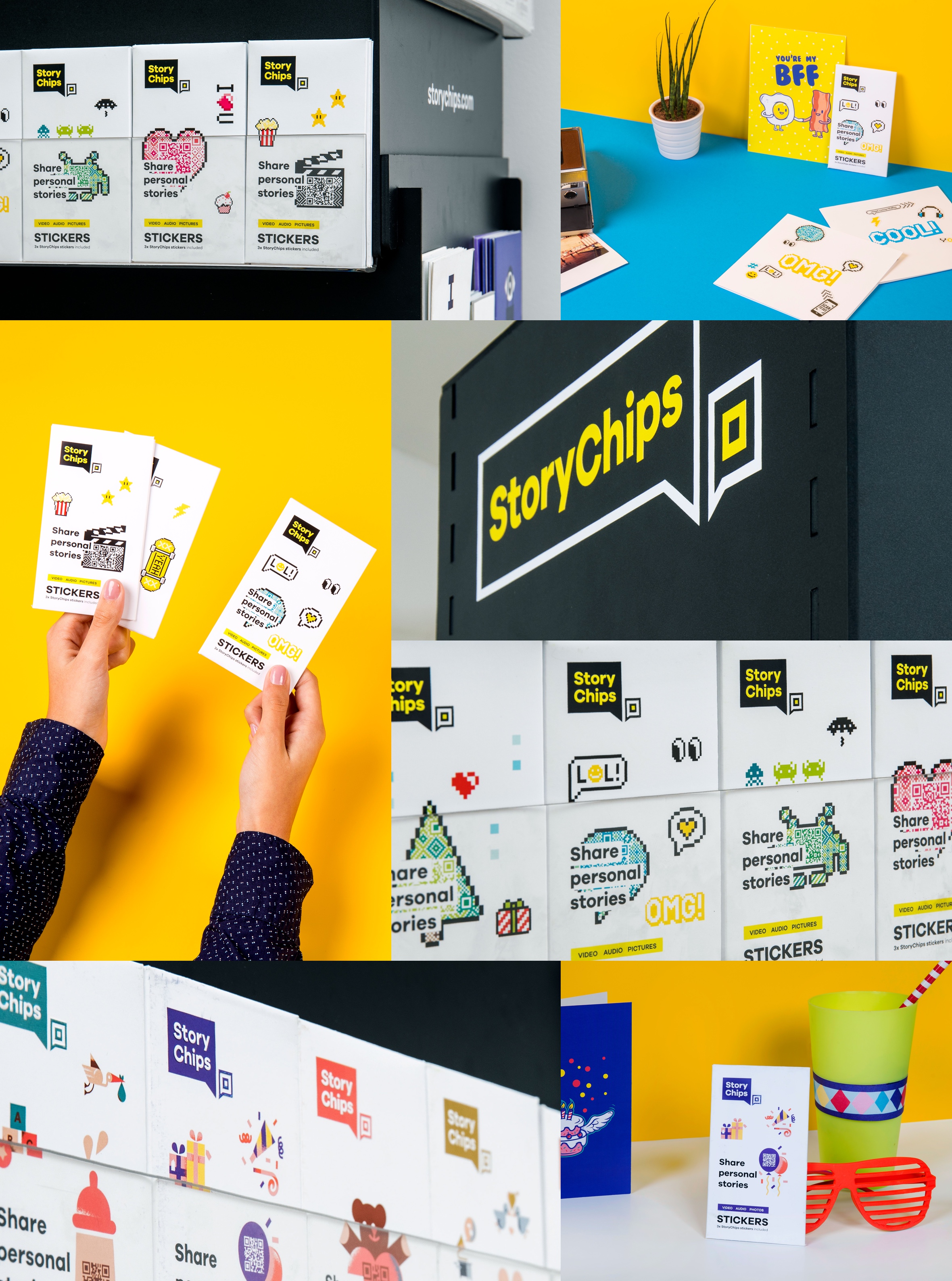
There was already an existing brand which was the name of the company, called Chipp’d. Since the purpose of the company was to move forward with a few different products, Chipp’d remained the mother brand and another name would born StoryChips.
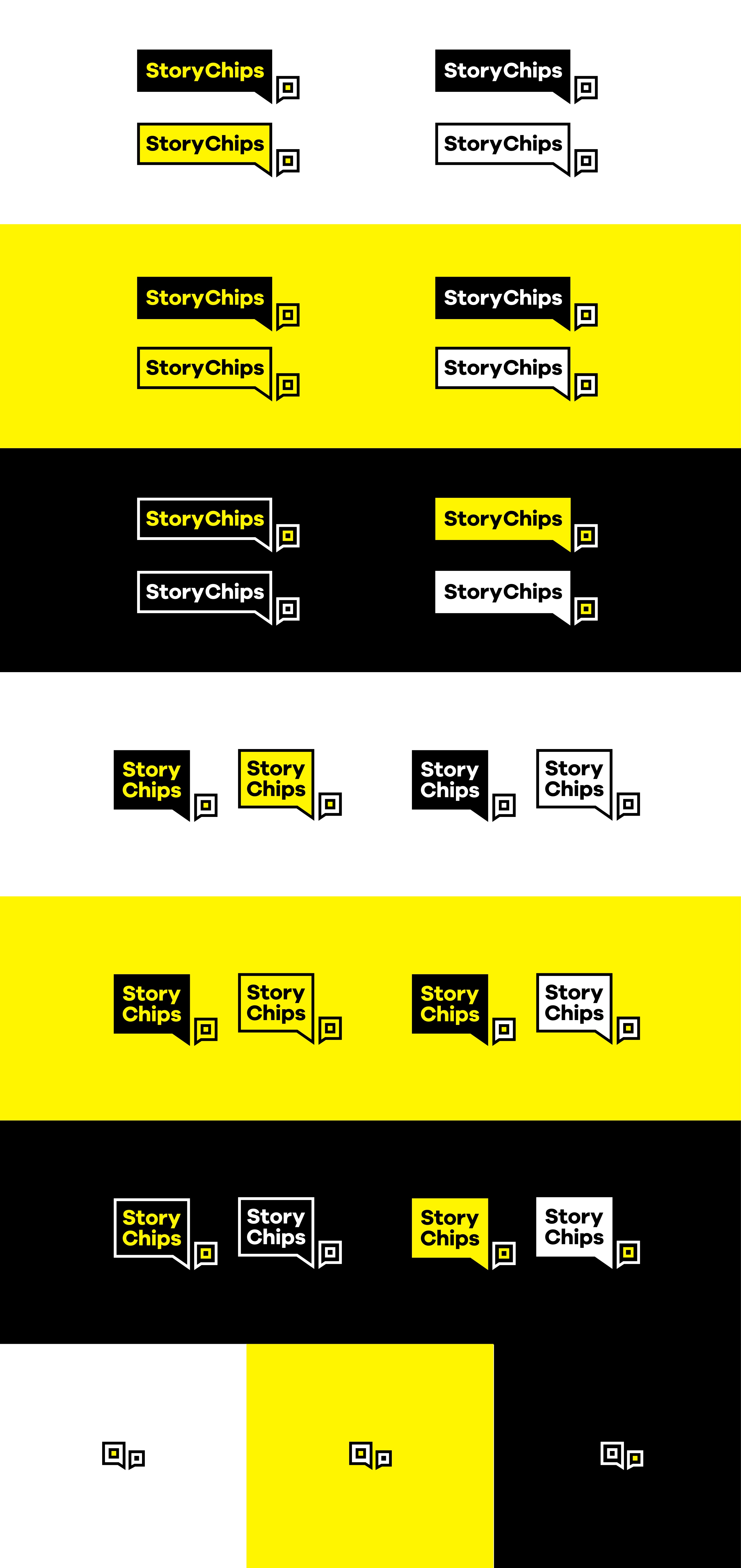
Logo
Logo

Since the product already had a few users, and one of the main points of the briefing was to keep some references to the old brand, it was decided to keep the name “Chips” as a connection to the previous name, which would still be the main company holding the product. I also decided to keep the shape of the speech bubble since the product is all about connection and carrying a message.
Colors
Colors

RGB - 255 245 0
HEX - #FFF500
CMYK - 0 10 100 0

RGB - 0 0 0
HEX - #000000
CMYK - 0 0 0 100

RGB - 255 255 255
HEX - #FFFFFF
CMYK - 0 0 0 0
Typography
Typography


Product
Product
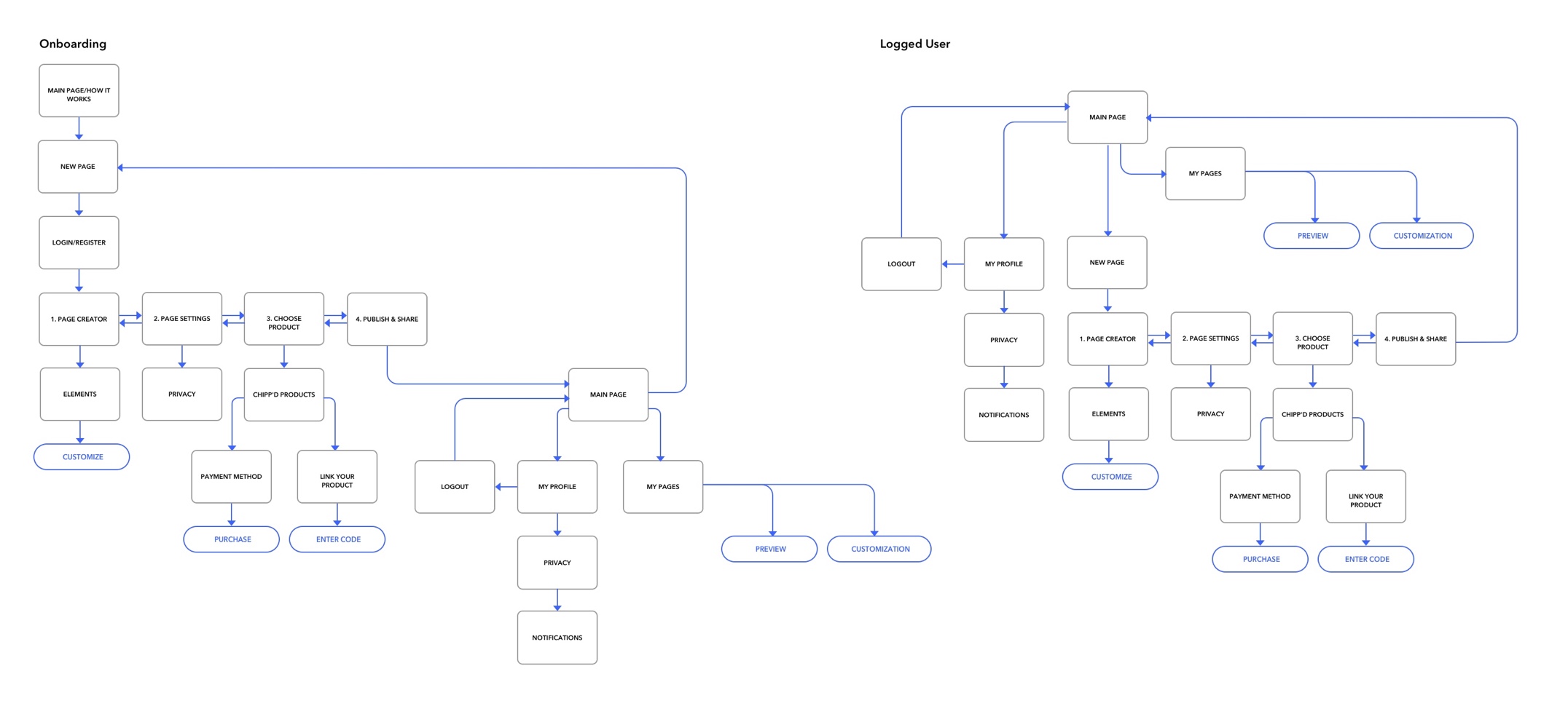
Now the brand was created, it was to time to put my hands on the product, starting with user-flows and wireframes.
Now the brand was created, it was to time to put my hands on the product, starting with user-flows and wireframes.
User-flows
Wireframes
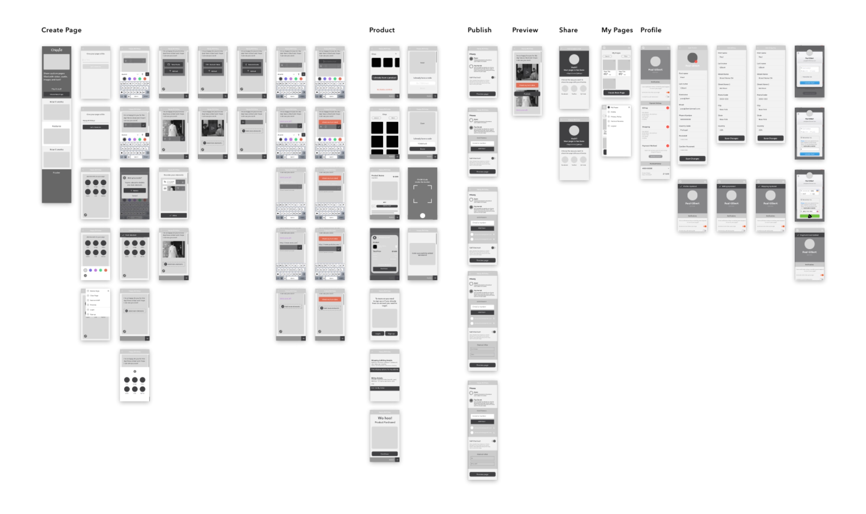
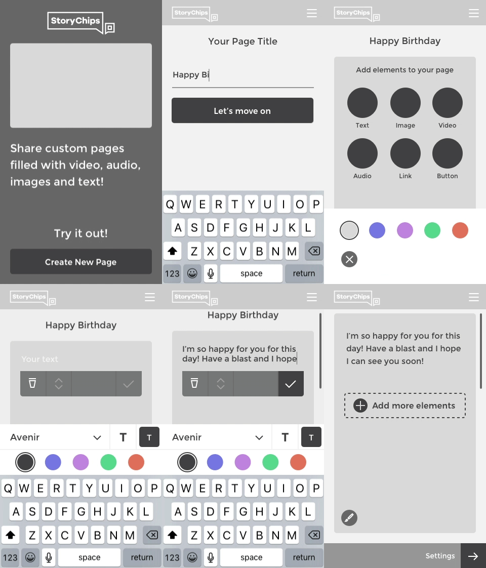
An early stage prototype on the text content
User Interface
Mobile


Desktop


Check StoryChips.com to know more about the project.
Check StoryChips.com to know more about the project.

