Web
2016
CLIENT
Three UK
INDUSTRY
Mobile telecommunications, Broadband internet access
ROLE
UX UI consultant
Three UK is one of the biggest Mobile telecommunication distributors in the UK.
For this project, I was a consultant mostly because of the work that I’ve done in the past for dubizzle regarding the design system.
What I proposed were changes to make the brand more present and breathe a little more within the product.
The ultimate solution for Three was to build a Design System from scratch, but my role here as a consultant was just to show and give a little glimpse of how something simple would help them so much. So I focused on three main things:
Spacing
Spacing
Typography
Typography
Iconography
Iconography
Spacing
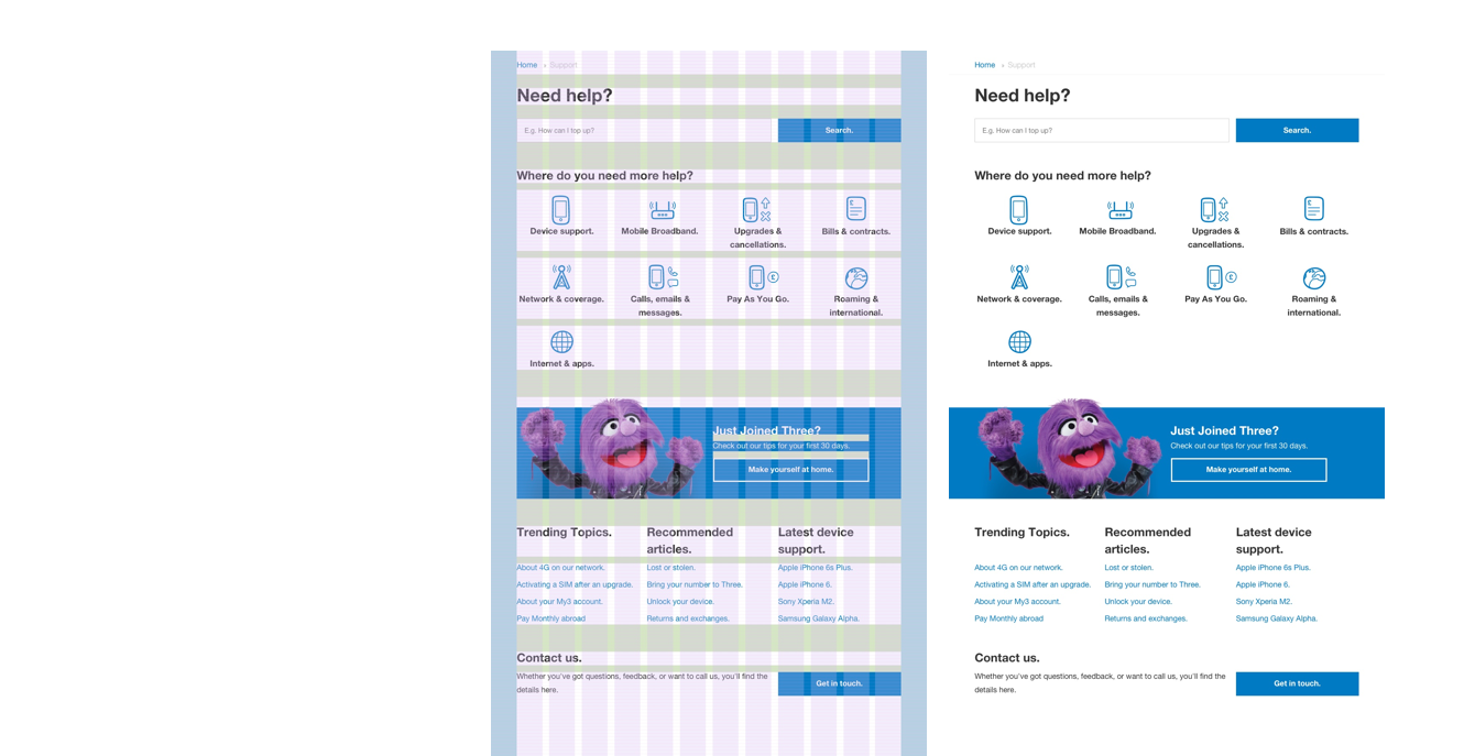
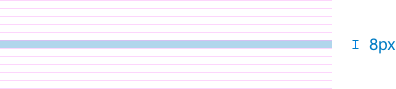
For spacing I built a system in order to maintain a certain vertical rhythm on the pages, I ended up with a grid of 8px.
Tested out a few spacing sizes on a multi-screen and came up with a pretty good number of them.
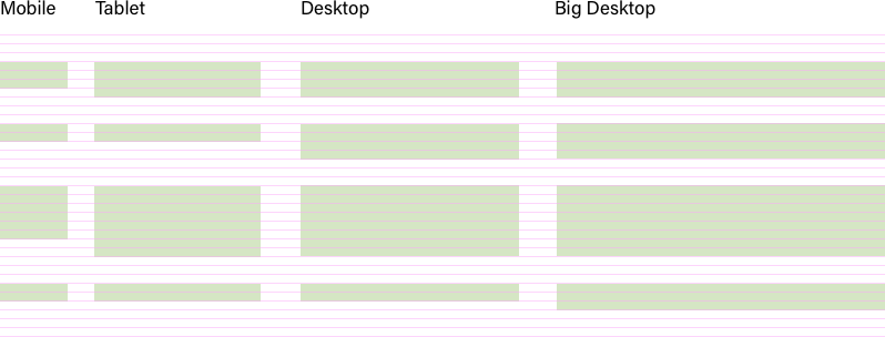
And did the same for the margins.

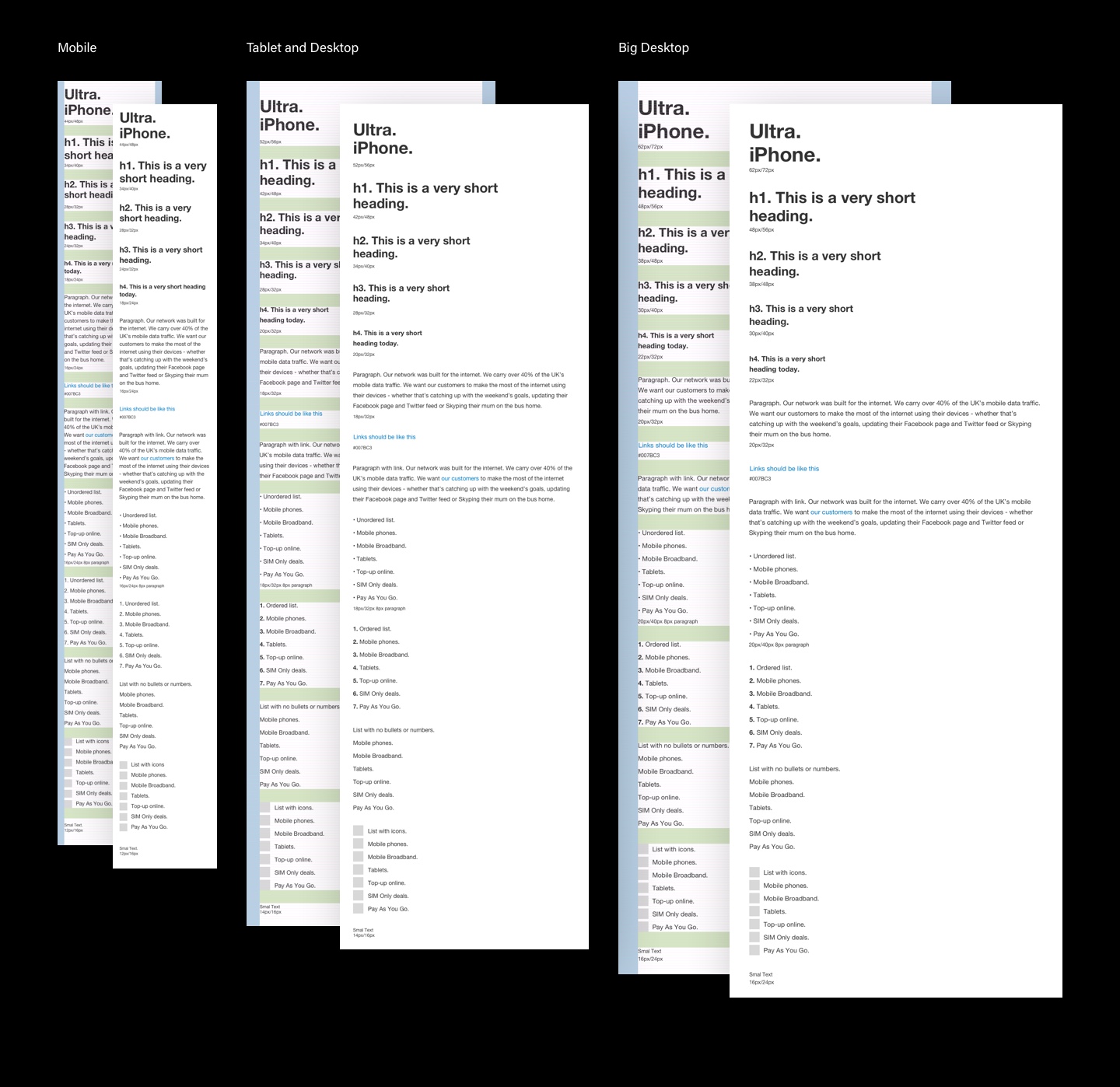
Typography
The brand was very simple and minimal so on the typography, there’s only one typeface being used, it was just a matter of finding the right balance to make it work in the spacing and the vertical rhythm.
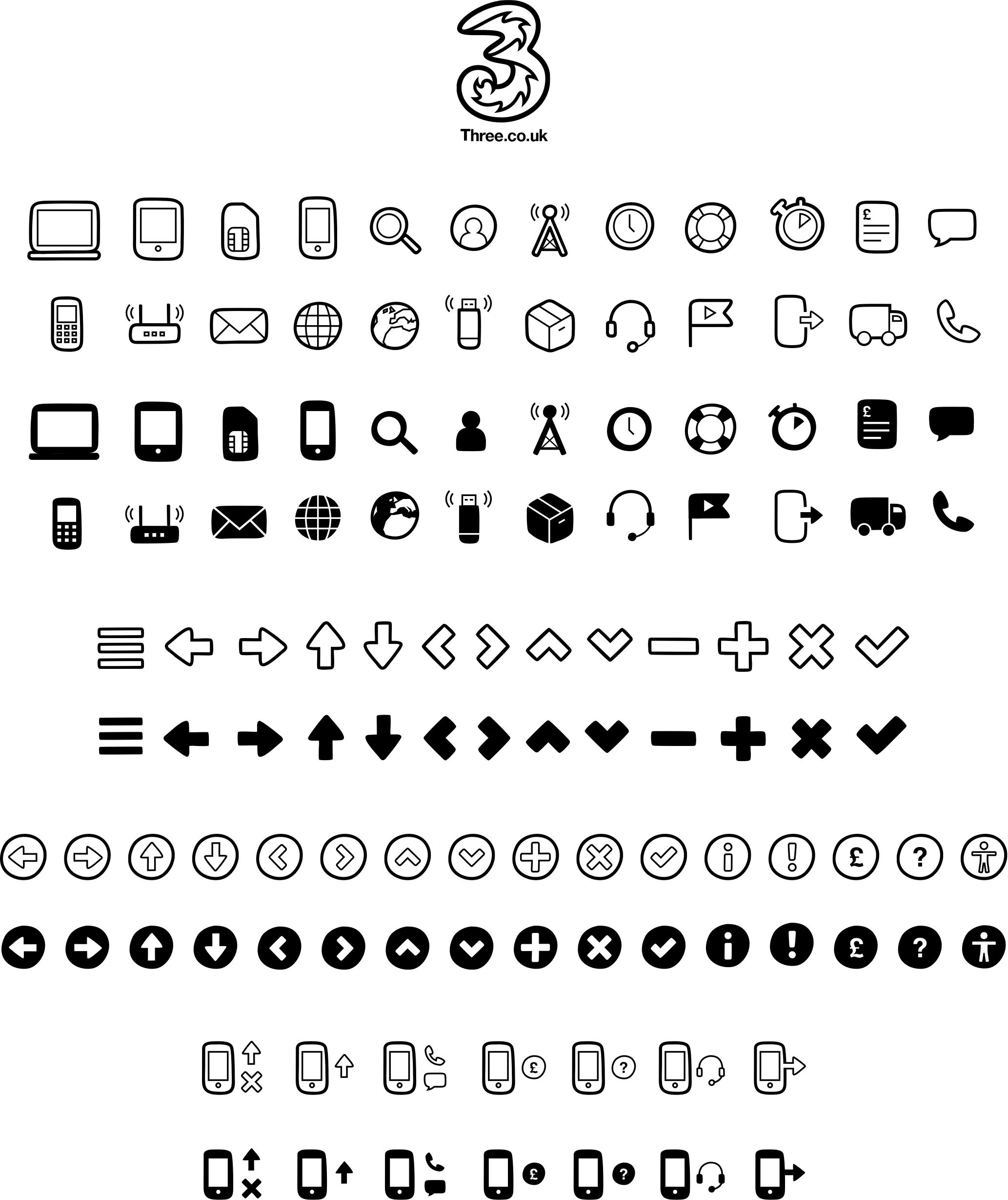
Iconography
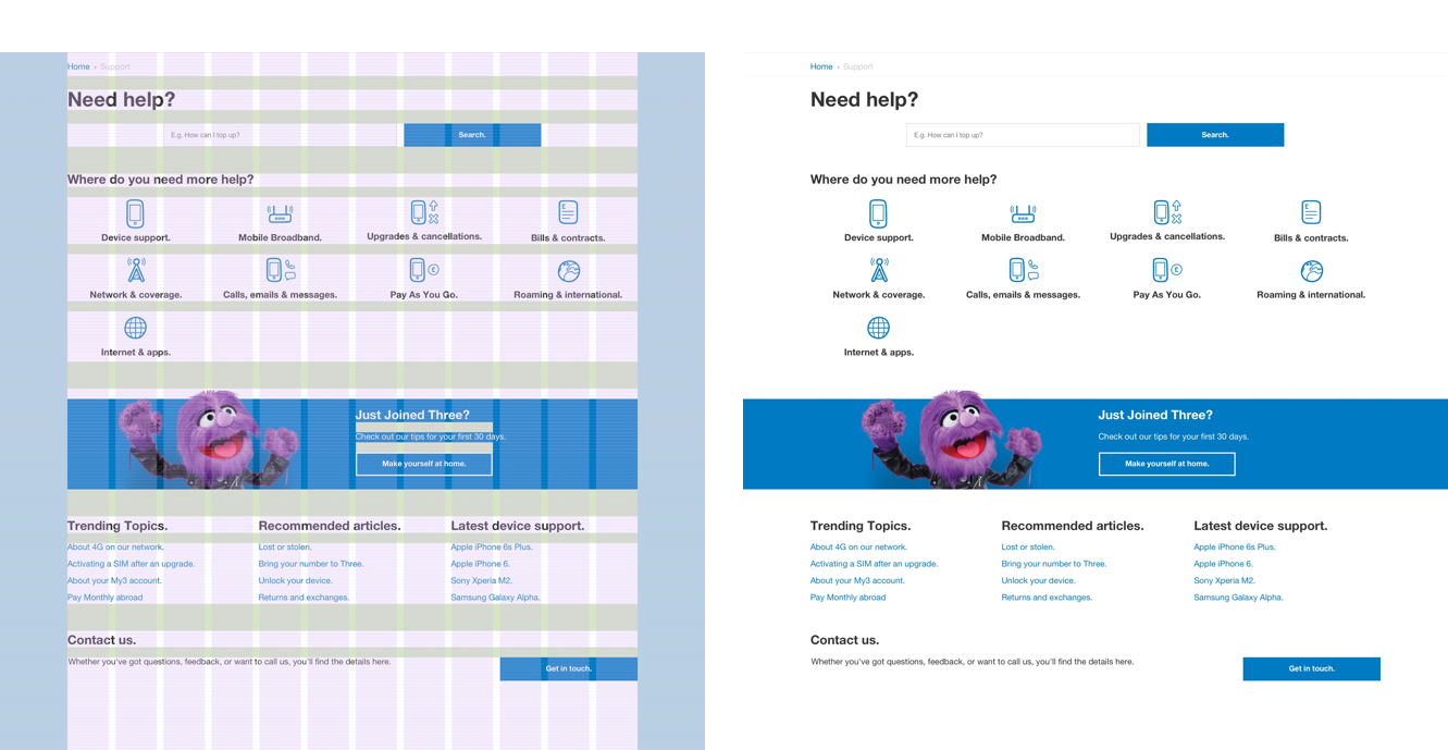
Iconography is always something I’m very excited about, and I like when companies try to get the icon as close to the brand as possible.
Since Three is all about simplicity and white space, my idea was to follow the logo as much as possible and make the icons stand out on the page, contrasting them with the typography and the straight lines.
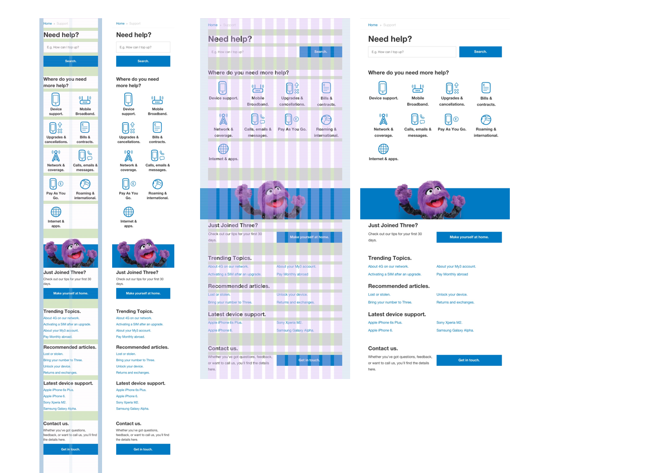
Application
Here’s a webpage example where I put it all together.